
Blissful Bites
Package Design | Branding | Illustration
How do you convey a sense of bliss on a box?

Challenge
The challenge was to design packaging for a mochi brand called Blissful Bites. The packaging had to be functional for both confectionary shops and grocery stores and visually appealing for consumers. The target audience ranges from the very young to the elderly who love sticky rice and sweets.

Solution
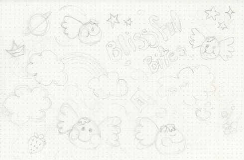
Since the name, Blissful Bites, is based on the feeling of pure delight and joy when a mochi is eaten, the package design had to convey a sense of bliss. To accomplish this, I created two different package designs, each catering to a different audience. The first design, with its whimsical characters, is more illustrative. The idea behind this design was to capture a blissful environment that a person’s mind drifts to when they eat a Blissful Bites mochi. Anyone who is young or young at heart would feel drawn to this design. The second design has a more modern, clean look, but the multi-color gradient background makes it feel blissful.
Color Palette

Inspiration

Typeface Exploration

Version 1
Sketch and Artwork for the Box's Exterior

Dielines

Version 2
Artwork for the Box's Exterior


Dielines

Artwork for the Inside of Both Versions

What I Did
-
package design
-
branding
-
illustration


